Showing posts with label design. Show all posts

2011 calendar sneak peek

I dragged my feet long enough with next year's calendar. It almost got to the point that I thought I wasn't going to design a new one. But inspiration finally hit and I couldn't be any happier. I'll be unveiling the whole thing on Monday.

2011 calendar sneak peek

Friday Tidbit
For those of you that haven't seen them... Head on over to the Decor8 and Oh So Beautiful Paper for great calendar round ups. It's one of the things I look forward to every year. There are so, so many great designs.

• • •

Thank you for all your sweet comments on my latest The Basics post. Sometimes I wonder if I should continue the series, because it may be too basic, but I guess some of you are getting some use out of it. That makes it all worth it for me. I'll keep the posts coming.

Have a great weekend everyone!

black & white

For the past three or four years I've been designing the invitation for the kids' school Casino Night fundraiser. The Black & White theme and white origami cranes that will be used for decorations inspired the invitation illustration. If you'll take a close look you'll notice that I used some hearts, spades, diamonds and clubs as leaves for tree. See them?

invitation

I'll be working on a large tiered chandelier that I've never attempted before so I hope it goes well. If the project is successful I'll be sure to post a how-to and some photos. Wish me luck!

new patterns on spoonflower

These are two designs that I've posted on Spoonflower. One is an older design and the one on the right is the latest one I played around with in the spring.

Some of you may wonder about my occasional ventures into fabric. The truth of the matter is that I really would love to see these on paper. While that happens (if it does, that would be another can of worms—albeit an exciting one to tackle) I like my patterns to at least see the light of day.

spoonflower

The fabrics with yellow in them will become cushions that are badly needed around here. We'll see if I like them when I get them done. Aside from our yellow kitchen our living room, studio and entrance spaces are decorated with neutral earthy tones and I know these would seriously jump out. But it doesn't hurt to try, right?

• • •

Thank you to OhDeeDoh for including my Alphabet Flash Cards in an adorable grouping of school-inspired decor.

how I see color

I took some random photos that I will be adding to my 'inspiration folder' and in this case they all deal with color.

Color can get complicated (which one to pick) or really simple when it's staring you right in the face and it resonates. I'd have to say that the objects that are around me give me the quickest color ideas. Yes, I use books and the internet as other sources of inspiration but light bulb moments tend to go off as I'm mixing ingredients for a recipe, arranging the laundry or out and about with the family. It's in the everyday that I find my best color concepts.

If you want more of a bullet point explanation, here are a few ways in which I find an interesting color combination or a variation of one specific color. It occurs when...

- One object has a pleasing palette all within itself.

green

- A group of objects create a coordinating palette.

combination

- A combination of texture and lighting offer a variety of colors in the same family.

raspberry

- Lighting alone reveals a variety of tones of one color.

orange

It's strange to write about color so clinically. The reality is that I work with color in a more intuitive fashion. I think we all do. It's just a matter of keeping our eyes open.

Where do you find your inspiration for color?

• • •

Friday Tidbits
There are so many sites that I could point out for color inspiration but to keep things manageable I'll only mention a couple of my favorites, one with a focus on design and the other more on the crafty side of things.

- Grain edit - Talk about eye candy! Color is just one tip of the iceberg. Illustration, design and creativity are all widely and well represented.

- Inchmark - Designer Brooke Reynolds has color (and so many other creative endeavors) down pat. Her blog is beautiful and she has wonderful projects and ideas.

• • •

Have a wonderful weekend everyone!

PS - Spain or the Netherlands? It's going to be an awesome game to watch. We are avid fans!

design and its applications

What a week!

Aside from the fact that our nine month old water heater needs to be replaced and that this detail wasn't discovered until Mr. Z came home and smelled the house was full of gas (ahhh that's why I had a pounding headache all day!) and other work related stuff, yesterday we lost our dog.

After an hour of looking for our little guy, in the pouring rain, I decided to make some 'lost dog' signs and the graphic designer in me kicked in.

As soon as I sat in front of the computer, I had flashbacks of the thoughts that run through my mind whenever I see other people's efforts. I always think of ways to improve them, in the nicest, non-snobby designer way.
- Don't use fancy fonts (clear is more important than fancy)
- The phone number should be larger (I've seen them itty-bitty many times)
- Replace the ink in the printer or use a photo that has more contrast. A dark box doesn't help much.
- If handmade and written use a very thick marker.

I whipped up some quick signs, we drove around hanging them in visible places and they did the trick. After 3 hrs. of going through awful scenarios of what we'd do without our Otto (who looks just like the second one here), we found him in the care of a lovely (and unknown until yesterday) neighbor. Phew.

In less dramatic and happier graphic design news...

One of my logos was selected to be included in the LogoLounge Master Library Series (Vol. 3) Shapes & Symbols. It's the third time my work makes into one of their books and I'm so very flattered to be included. Thank you LogoLounge!

thank you

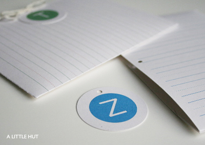
For those of you that still have kids in school, I put together a freebie PDF of lined thank you cards (or gift tags) that your little ones can include with teachers' gifts. I tried posting this a couple of weeks ago but that obviously didn't happen. Some of you can still get some use out of it, I hope.

thank you printable

To all of you that are teachers a huge thank you! I don't know how you do it. I'm always amazed with everything you accomplish in a few months and you truly deserve all the gratitude and appreciation in the world.

thank you printable

The summer has barely started and I already feel much more at ease. The daily driving to and from school, homework and lunchboxes has been replaced with a much slower pace affecting everything—this blog too. I'll be checking in now and then but for now things will slow down quite a bit around here. You get it right? :)

A bit of errands and a promise to take the kids to the pool await.
Have a great day!

Download printable here.

new work - eraser boards

I don't think I've ever mentioned this before but aside from paper there is another thing that I've always had this weird attraction to—office supplies. Pads, pencils, drawer organizers, pink erasers, wooden rulers, file folders—you name it I melt. If they look anything like Muji products or something more colorful, when I'm in the mood, then I'm in heaven. So, what to do when an eraser board looks so terribly boring? Design one yourself.

Below is my solution to write my 'must be done today' to-dos. If I see them in front of me they really get done. These are really sturdy and they can be hung or kept within reach on your desk.

new!

Are you a paper/pencil, digital or eraser board to-do lister? I'm actually a little of each depending on what it's for. Paper/pencil is for right away or if I'm on the phone, digital (or online) for work and like I said eraser board is for 'musts'.

For now I have very limited stock of these two designs in my shop.

new!

old shapes inspire a new project

Welcome to March, my favorite month of the year. Spring is in the air and I can't wait for it to be really here. I think that may be spurring on my efforts to do some reorganizing around the house (do toys reproduce on their own?). I want to purge, purge, purge. It's slow but it's working.

So... the organizing effort has reached my computer and I dug up some designs that I hadn't seen in a while. I have a folder of patterns that I add to every now and then. I work on them as a way to take a break from other projects. I haven't done anything with them yet. The obvious would be for them to be printed on paper or fabric but I'm actually thinking of using them in a three-dimensional paper (or wood) quilt of sorts. It's that too off the wall?

found

process

Jessica, Jan, Jenean and Michelle started it and I've decided to give it a go myself. This is just a little glimpse into what happens when we take an idea and follow a process until it becomes something a bit more cohesive and/or useful.

The ladies that I mentioned all blogged about their pattern making processes. In my case, I started with yesterday's) sketch and ended up with a prototype for stationery. It could easily become a pattern for anything else I suppose. Below is the hypothetical example that I worked on today.

1 - I scanned my sketchbook and used the image of my doodle as a backdrop in Adobe Illustrator. I placed a white transparent box over it (digital tissue paper of sorts) and started tracing over the image. The end result is a graphic and clean look.

sketch

2 - After a lot of moving things around I end up with these. The image on the top left is the one I created today. The image with yellow accents was the one I posted yesterday. The big difference is obvious. The feel is completely different in the yellow version because it is hand drawn and color was added digitally.

ideas

3 - One thing lead to another and I started wondering about other shapes. The bottom left is where I'm just trying to figure out what I'm going to do with two of the bowl/flower shapes. The bottom right is the final combination of the two elements. It reminds me of a logo mark.

In essence I ended up with three distinct looking images from one sketch idea. Two plant like shapes and one graphic icon.

4 - Applications - Below are just a couple of possible applications for two of the images. My favorite is definitely the top one. I'm actually thinking I may want to try it out printed on fabric for a cushion.

idea 1

hypothetical idea 2

And that's it. This exercise could go on and on. Like I said this is something I just worked on this afternoon. If I had more time to refine this who knows where I'd end up.

By the way, for any of you wondering, this process doesn't work for my paper projects at all. I mentally go over, and over my 3D paper projects before ever touching paper or my Xacto. Once I have the design in mind I may sketch something out really quickly to record measurements and then I just go for it. Nine times out of ten, what I had in my head works out and it looks exactly the way I imagined it.

Anyone else interested in showing their process? We'd love to see!

break

Sometimes I just need to take a break from 'real' work to play around a bit. It sorts out my brain and it feels like hitting the reset button. It also allows me explore ideas that are always floating around in my head. Lately I've had many and I've acted on exactly... zero. So frustrating and suffocating.

The designs may look familiar. I'm reusing my, now sold out (thank you all!), die cut calendar images. Filing would definitely be a bit more fun with these.


Here are two articles that have me really thinking about my current lack of 'going for it' mentality.
- Push - As Paul says, we need to blaze our own trail and be true to ourselves. I couldn't have read this at a better time.
- You can become and indispensable linchpin The resistance that Godin talks about is exactly what I'm talking about. I need to let it go. So many ideas... so much resistance.

I just need to jump off the cliff! Anyone interested in shoving me over?

the chosen five

I'm rather quiet about my graphic design work here. I'm not sure why. But it still is a big part of what I do. My design business was my first venture into going solo and the reason why I stayed sane a year after quitting my full-time job. I still enjoy splitting my time between Zapata Design and A Little Hut. It keeps me balanced.

If I had to pick only one thing to design it would be logos. They're challenging and entertaining at the same time and you never know what you're going to end up with.

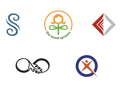
I'm happy to report that these are the logos that have been selected to be part the first book of Initials & Crests in the new LogoLounge Master Library series. It will be published by Rockport Publishers next year.


Top (left to right)
Saratoga Springs - for a neighborhood in Phoenix
V Spa - for the Hilton Anatole spa in Dallas
Sumpter & Gonzales - Austin law firm

Bottom (left to right)
The Myositis Association - Washington DC
People & Partners - UK

• • •

FYI - I posted a new interview on Crafty Synergy. Come by and visit here.

some yin for my yang

I was just going through my archives to add some work to my portfolio on Logo Lounge (an amazing online logo library - worth every penny of membership!) and this is some of what I added. You may recognize at least a couple of these logos. It's rare that I get to see a group of them like this and I find it to be such a visual treat. It makes me feel like I'm really getting somewhere. I don't know where the finish line is but I'm in forward motion regardless.


This got me thinking about the two worlds I work in: the digital and the handmade. I love them both for different reasons and I don't think I could do without either one of them. My logo work starts with a lot of communication and interaction with my client and then a type of hands on approach in the form of sketches. However, the majority of the time involves the steady click of a mouse and lots of back and forth emails.

My handmade work is so different. I typically start working on a piece with no outside direction other than my own gut feelings, ideas and whims. I work entirely by hand and the end result is purchased (hopefully) by someone that I will never speak to, let alone meet or given away as a gift. The latter occurs less frequently because I have this silly thing about feeling self-centered when I give someone something I've made. I know. I need to get over that.

So where am I going with all this? Not sure. I guess I'm just thinking that finding the right balance with what we do and how we live is really important. I'm only mentioning the balance in my work life but it obviously applies to all else. I don't consciously check my 'life scales'. They just seem to gently rock back and forth on their own. Thank goodness.

Speaking of giving something away... I couldn't leave well enough alone and instead of giving our cards and 'thank you' drawings to our kids' teachers in a plain envelope I made the small folder type pockets below. They match the cards I made the other day. I know I called them gift tags in that post but we used them as note cards this time. You can't go wrong with versatility.


My little C decided that the little graphic in the corner of each card just wasn't enough (even though she did stake her claim really quickly on the school house and apple). She added hearts and a portrait of herself, standing next to each of her teachers, on the back of each card. Someone seems to be taking after her Mom. Nah! I'm not beaming that's just the glare of your monitor.

Good news for the day:
- My little C graduated from Pre K today. What is it with me and the mommy tears? I just couldn't help myself. She looked so cute in her cap and gown.
- My blog made it to a very unexpected place. Neat!

Don't forget there's still time to participate in my anniversary giveaway. Just leave a comment here! I'll let you know who wins at noon tomorrow.

a little something for me

My shop has been at a stand still for a while. There's a couple major reasons for that. The first, is that spending the summer with the kids put all that on the back burner (as it should have been). The second, is that I'm struggling with focusing on a certain creative voice, style, whatever you want to call it. I think the cut paper constructions I've been making are getting me there. I don't know how but I feel it coming.

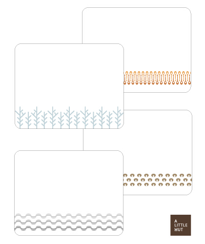
In the meantime, I've been fiddling around with some patterns (I've shown you a couple before) and I wasn't sure what to do with them. Tonight it dawned on me that I don't have nice flat note cards to write on and in my opinion that's a tad absurd. I also decided it was high time I have something a little more contemporary, so here are my new simple designs. I'm going to be printing these on beautiful recycled card stock. Yes!

fresh off the press


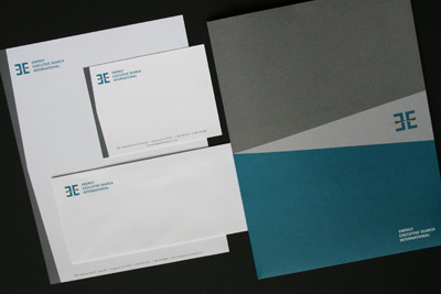
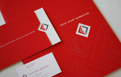
This is a logo and corporate identity package that I finished for a client. They wanted something very conservative and corporate but modern at the same time.

a surprise in the mail

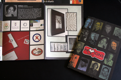
I mentioned the HOW conference and the fact that I would be mentioned as part of a session there. Well, I got a pleasant surprise in the mail today from Sheree Clark (the speaker). She sent me a couple of copies of the brochure that was handed out at during her session. If you click on the photo you can see it a little larger and clearer. The entire thing folds out to the size of a poster and it's such lovely eye candy.

Recognize anyone? I'm so glad I took the time to actually take a decent photo of myself! On the cover it's little ol' me surrounded by such amazing designer gods. The more I look at the whole thing the more I think 'what the heck is my work doing there?'!! The work of everyone that was featured is amazing!

Thanks Sheree!

how

Even though I won't be attending the annual HOW Conference (in Atlanta this year) I will be there in spirit. My design work and my A Little Hut work will be shown in one of the sessions called "Inspired By Our Passions: The Pursuit of an Enriched Life". The session will be about how graphic designers are pursuing other avenues that interest them outside of graphic design. The photos that I sent for my ALH work are my favorites from this blog (including the photo of the "new" me - remember?). I wish I could be there to see how the presentation will be put together. It's humbling (and kind of scary!) that so many designers will see my work.