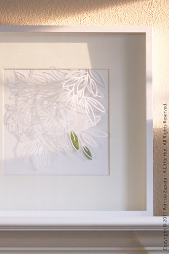
I know—this may not be terribly exciting since I just showed you this paper cut a couple of days ago. However, it is very exciting to me since I gave this piece a frame (I'm bad about that), a place (for now), I'm starting my idea to get more artwork around the house (not all necessarily mine) and we're enjoying it already.
When I first started working on this paper cut it was about 2am and I really had no plans for it. I just went for it. Yes, you've seen these leaves before—here and here. It's just feels like one of my 'comfort' doodles (is there such a thing?). They always look the same and I thought a paper cut would be an interesting change.
When I first started working on this paper cut it was about 2am and I really had no plans for it. I just went for it. Yes, you've seen these leaves before—here and here. It's just feels like one of my 'comfort' doodles (is there such a thing?). They always look the same and I thought a paper cut would be an interesting change.
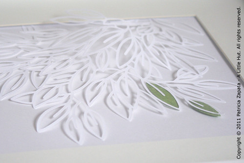
I'm still debating whether I should change the white background. I really like it but at times it does seem to lack contrast. The great shadows are what keep me thinking. They wouldn't look the same on a colored background.
As you can see in the top photo, the afternoon light makes this really come to life. The way the shadows change as the sun sets is quite dramatic and constant—love that.
I wish I could've gotten a better shot of the three-dimensionality of the piece, to show that I didn't just lay the cut out on a piece of paper. I placed it in such a way that it is only attached at the top. The top corners are glued down closer to each other than if they were laying flat. That is what makes the whole piece pop up on its own and stay that way. The green leaves are attached to the background, not to the cut out.
So what do you think? Color for the background or leave it as is?
Cost of materials: $2 for paper and $20 for the Ikea box frame.
• • •
This is part of a my 26 days of making series.


No comments:
Post a Comment