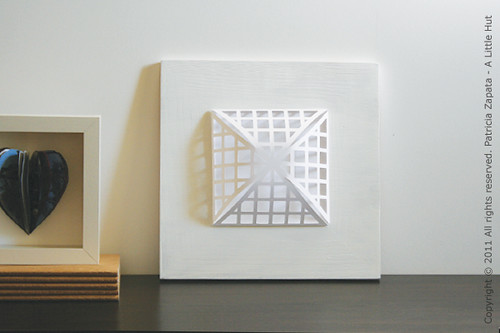
Remember this piece from the other day?

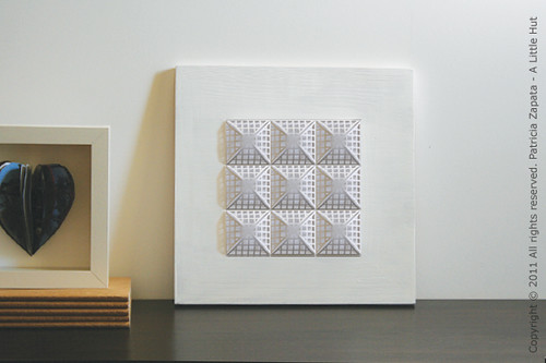
What if it was like this instead?

How do you feel about it now?
I mentioned in my newsletter that I couldn't wait to see this in a more repetitive form (9 pyramids). But the more I thought about it, the more I thought that with this particular design the idea really wouldn't work. After a bit of Photoshop work (so glad I thought of doing that first) I realized that I was partially right. Part of me thinks it's too busy, part of me prefers the original.
Always edit.
I tried out the busier option after the fact and found out that my initial instincts where accurate. I edited before realizing that I had done that. Typically it goes the other way around. I start with something more elaborate and then I edit, edit, edit.
I think the best ideas are the ones that take a concept to it's minimal point without losing their twist or interesting point. Editing is just another way to create. Think of it as applying carpentry to an idea.
Minimalism vs Editing
They are not the same. I'm a minimalist at heart and many of you may not be, but editing benefits every single project. Where you draw the line at editing or where I draw it, if we're working on the same project, may be very far from one another. The point is that we've each taken the time to make our ideas more solid. That's what counts. From that point forward, taste and style take work to another level and keep the world interesting.
Next time, you work on any given project ask yourself:
Does everything there have a purpose? The answer may be "No, but I like it anyway"—and that's fine too.
Can I get rid of anything?
Does anything look like it's an afterthought?
Tight ideas make for better design.
• • •
Talking about minimalism and editing... here are interesting examples of how they affect packaging.
Now I think it's time for some tea. Have a great day!

No comments:
Post a Comment