
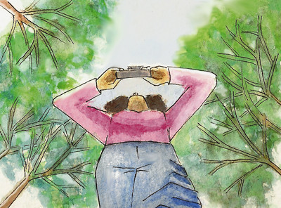
I bought a set of watercolors the other day and decided to have a go at them. This is my first watercolor in forever and I wasn't even that great when I did work with them in college. Now is when I completely regret having blown off my watercolor class. Back then I was so worried about my design projects that I let the class slide with work that wasn't even my half-best effort. To admit that...ugh!
So anyway here's my attempt at fixing some things that I didn't like about my previous "Feet" illustration. I like some things from that illustration better than this one. I prefer these trees but I like the angles of shades and line drawing of the figure of my first illustration. At least it was worth a try.
I like both of your entries. :) This one has a different feel to it though. Fantastic idea. It's another great way of looking at things.
ReplyDeleteLove the watercolors!
ReplyDeleteI like them both, but I think I like the colors in this one better. It's interesting that the darker one with the harder wdges and digital color has a more ominous look to it...like the trees are hovering over and around the figure. This ne gives a lighter feeling of soaring into the sky...probably more like how you felt looking up at those beautiful trees. It's great that you're trying wc again...that's the way to get good at it (although this looks fine).
ReplyDeleteBeautiful again, I love watercolours!
ReplyDeleteI like this one better. It is softer and more in sync with nature. The bold solid colors of the previous one, although fantastic, did not give the same feeling of quietness you would expect in a forest.
ReplyDeleteGreat job on both of them!
I like the feel of this one better. It feels more open, softer, more inviting.
ReplyDeleteUh...but I know nothing about art :)